Practice

Jean-Baptiste-Camille Corot

An Overview

A Stream: Near Beauvais (1860-70), detail

A Stream: Near Beauvais (1860-70), detail

Today I’m delighted to share with y’all some inspirational info about Jean-Baptiste-Camille Corot (1796-1875). Corot was a prolific landscape artist. Like many landscape painters in his time, he travelled often and worked among other painters. (At times he invited other artists to complete sections of his work. Check out Zuydcoote Near Dunkirk by Corot, Daubigny and Oudinot to see three different styles in one piece). Collaborative paintings fell out of favor as the Impressionist movement (and its emphasis on originality) gained momentum and single-artist works grew in favor.

It was common practice for landscape artists of this era to develop and hone their techniques for capturing a scene by working through several studies. Studies such as these were completed en plein air alongside the artist’s close observations of nature and were invaluable in helping artists plan and finish paintings from memory later on in the studio. The detail that these masters achieved with the oils on their canvases required patience with the lengthy process of layering textures and colors. Artists’ carefully rendered field-studies allowed them to capture the luminous lights and colors of the natural landscapes while working over a longer length of time in the studio later on.

Although such studies were never meant for exhibition, some of Corot’s early Italian studies became known as some of his greatest achievements after his death. The power of studying one’s subject closely and producing several studies in order to become better acquainted with the subject cannot be underestimated. Here is a lovely excerpt from one of the placards at the Frye Art Museum exhibit (in reference to Souvenir of Lake Albano, which I have not been able to find reference to online since, so I wonder if I wrote it down incorrectly. Yet still, the beautiful expression of how he approached his craft is worth sharing):

Rather than conjuring an imaginary Italianate landscape from the time of antiquity as his teachers of the Neoclassical school would have done, Corot evokes a more romantic quality, suffusing [the painting] with a silvery light and an emotional resonance based on his own subjective experience of the site.

The Lake: Night Effect (1869), detail

The Lake: Night Effect (1869), detail

These opposite approaches to landscapes fascinate me. The neoclassicists would ‘conjure up an imaginary… landscape… from antiquity’ and produce a more realistically rendered landscape setting in their finished piece. Conversely, Corot (as a Realist, Romantic and predecessor of the growing Impressionist movement) would spend time with a particular place, soaking it up, learning how it looked in all manner of changing light, and complete many studies en plein air to assist him in his work back in the studio. But the purpose of completing studies to inform the final painting were never about capturing the accuracy of the moment alone, but moreso the feel of it. While the neoclassicists were interested in using landscapes as a backdrop for their prosaic paintings (insisting on including characters from well-known tales so as to legitimize the need for painting a landscape), the Realists, Romantics and later the Impressionists were seeking to capture the feel and experience of a place itself and for the place to take center stage as the subject of their poetic brush strokes.

As Corot entered the last quarter of his life, his approach shifted somewhat and he exhibited nearly 30 paintings with titles beginning with souvenir, which means recollection or remembrance. These paintings were completed mostly from memory and are akin to lyrical interpretations of his senses of the places themselves. It seems so next-level to me. After years of spending time soaking in these places during his extended time there, he painted them without the need for any additional preparation or study. He had assimilated them into himself so completely that he could paint their soul straight from his own.

Takeaways

There’s much for us to glean from Corot’s working life. Here are the things I want to remember to integrate more into my own artistic practice. I invite you to do the same!

  • Corot understood the value of community. He surrounded himself with other artists and enjoyed collaborating with his friends. He wasn’t afraid to invite them to add some of their own style and creativity to his own pieces. - Where are there opportunities for us to connect with and collaborate with other creative folk? How can we let people in to our creative experience?

  • He spent time studying each place. To my thinking, the completion of studies to later use as reference materials isn’t at all the point. The significance of this practice is the time spent making the studies themselves. Imagine, spending time with a place through the changing light of each day, through shifts in weather, and the turning of seasons. The practice of completing studies helped him see the place more fully and integrate it more deeply within himself while also helping him work out complex plans and strategies for executing the eventual final piece. - What one place or object can we commit to spending time with and really getting to know? Can we give ourselves permission to work through study after study and let the focus be on the process itself? Can we sit with something that we care about, diligently practice our craft, and simultaneously work out both our relationship [with the subject] and our technical skill without fixating on a final finished-piece throughout?

  • He understood that there’s more than one way to portray a subject and that the Neoclassical way that he was trained wasn’t the style that resonated with him. - Spending time soaking up our subjects does not necessitate stressing about conveying visual realism. We also don’t have to provide any justification to make our beloved subjects somehow worthy in the eyes of others. Let’s be kind to ourselves, nurture a strong relationship with a subject that really matters to us, and then portray our beloveds in our own unique style. Let’s shift our focus from perfectionism and fix our eyes instead on the essence, feel, and spirit that we want to convey instead of getting bogged down in the perceived technicalities of our craft. (Is it possible that those technicalities will begin to sort themselves out naturally as we spend time creating study after study as a means of getting to know our dear muse? I think so.)

  • Time spent nurturing relationship is never wasted. All the memories of cherished places that he assimilated into himself throughout his life grew to become the loose, poetic, dreamy work of his later years. - If no particular muse is calling to us now in our present moment, certainly there is some cherished memory lodged within each of us that might like to dance upon our pages?

A Path Under the Trees in Spring (1860-70), detail

A Path Under the Trees in Spring (1860-70), detail

In answer to those reflective questions above, here are the goals I’m setting for myself in the spirit of learning from Corot:

  • I will work on opening myself up to creative community a little more, which I admit I’m sometimes slow to do because of my own insecurities. This will be a work in progress for me.

  • Because I’m traveling and my scenery is ever changing, I will look for a portable muse that I can really spend time with and get to know. Honestly, I have no idea what that might be, but I’ll be on the lookout for something worthy of the kind of devotion that Corot gave to the places he painted. Then, I will emphasize spending time with my muse and completing studies for the purpose of knowing them better, not for the purpose of creating a finished piece. By emphasizing this shift in perspective I will work to avoid the pitfall of stressing about my technique or perceived lack of skill.

  • My studies will emphasize the use of pen-and-ink because that is my passion. My love for it is in some ways inexplicable because it’s so stark and high contrast and is the opposite of all of the soft, gentle flowing, colorful things that I crave and love. But Corot reminds me that it’s not the medium that evokes poetry or prose… it’s the spirit I bring into the application of my craft. So, because I resonate with his poetic spirit and want very much to draw poetry more than prose, I must trust that with practice I can convey such poetry with something as simple (and stark) as a black ink-pen.

  • Because I’m hoping to cultivate a relationship with a muse, I’m going to make that my main focus. But I’m thinking that drawing from cherished memories could be a great warmup exercise as I sit down at my desk each day. At this time, I’d like my muse to come from my current life instead of my memories. So I’ll be dipping into my memory bank for additional inspiration or for warm-ups to help me get loose and focused for the day’s work. (Also, I’m committed to reminding myself that any memory that should make it onto my page was never carefully studied for the purpose of artist-rendering (unlike Corot’s purposeful study of his subjects) and so I will be kind to myself when my memory-drawings inevitably turn out wonky and don’t look at all how they are in my head!)

I guess, in summary (and I’m saying this as much for myself as for you, dear reader, if you are in need of hearing it) - I’m imploring us to inject more heart into our art and less brain - to choose a subject we can let ourselves be captivated by and study at length, trusting that such a joyful fixation and disciplined approach will naturally let us grow in the technical skills that so worry us beginners and too often keep us from beginning.

DIY Art Education: Visiting Local Museums

Art education takes many forms and when you’re building a DIY program like I am, you rely on locally offered classes, online courses, and visits to art museums. Last summer we visited the Frye Art Museum’s exhibit “Towards Impressionism: Landscape Painting from Corot to Monet.” The exhibit explored “the development of French landscape painting from the schools of Barbizon and Honfleur up to Impressionism.”

My knowledge of art history is slim at best, but I’m eager to learn. I went to the exhibit without knowing anything about French landscape painting, oil painting, the French schools of thought on painting, impressionism, or any of the key players during this movement with the exception of being vaguely aware of Monet and his impressionist style (Thank you, Cher!). After studying the paintings and reading all the informative placards throughout the exhibit, I was filled with appreciation, excitement and new eyes for seeing the landscape around me.

To say it was a stunning exhibit falls short in describing the experience. Do you know the scene in Ferris Bueller’s Day Off when the three truant teens visit the Art Institute of Chicago? As the music reaches its climax, Cameron finds himself caught in an intensely contemplative moment. Standing before George Seurat’s A Sunday on La Grande Jatte, the camera follows Cameron’s gaze deeper and deeper into the pixelated image. The French landscapes pulled me into their water, trees, and skies in just the same way.

Because I was keen to further my education, I took many reference photos and notes during my visit to the museum. It’s always been my hope to share what I learned from the exhibit with others. My hope is that others who dream of an art education and must find it off of the beaten path will be inspired to make the most of opportunities like this one in their own communities.

I’ll be featuring information gathered from the exhibit along with photos taken at the exhibit in the coming days. Our first featured artist will be Jean-Baptiste-Camille Corot, who is the artist of the piece featured in this post. Stay tuned for tomorrow’s post when I’ll share more about him and his work!

Little Goats

It’s a sad tale, which is why I wanted to draw it.

You know the kind of grief that’s barely there? Like if a musician that you don’t know dies, or maybe the neighbor’s dog, and you didn’t know them, but you’re left with the small feeling of emptiness that comes with knowing you won’t hear new music from the person or see the dog smiling1 on the other side of the fence ever again? That’s what I was feeling today.

It’s the kind of grief that you don’t really know what to do with because it’s so faint. But you want to do something because you can feel it sitting there inside you.

Today I dealt with mine by drawing a comic about it. And because I usually spend all of my time in my head worrying about my lack of artistic skill instead of actually putting pen to paper, I knew I must do it in pen from the start and not use any pencil.

The number one thing I took away from Steven Reddy’s class was to put pen to paper as soon as possible and figure it out from there. Don’t overthink, over-stress, or over-plan, just start and let it unfold as you go. This will inevitably lead to idiosyncrasies that I’ll have to figure out, but it will also contribute to developing my style.

So in this case the goats are wonky and one goat is climbing the fence wile the other sticks its nose through it and they completely don’t match in scale or perspective. But I’ve never drawn any goats before, so it’s honestly just a big win that I drew six goats today in different scales and iterations. I also drew my first ever hand and it’s rather weird, but I’m counting it as a wild success because hands are hard and yet there it is on the paper, recognizable even.

I wouldn’t have drawn any of these things if I had started with a pencil. I would have spent my time worrying about getting it planned out and perfect and would have another unfinished project that would languish forgotten in my sketchbook. I wouldn’t have proven to myself once again that I’m capable of problem-solving drawing challenges way more than I give myself credit for. I would have gotten so bogged down in perfectionism that the story itself wouldn’t have been told.

Stories are the reason I feel the urge to draw and write to begin with. I’ve always been full to bursting with them and I need a way to get them out. I’m so much more interested in telling stories than not, so it’s imperative that I get stuff down on paper, as imperfect as it is, rather than sitting on it waiting to feel “good enough” and missing these opportunities completely. (As my dad pointed out, this isn’t just good advice for drawing, but for my whole life. I need to ink in my life with bold strokes instead of constantly trying to edit it, worried about getting everything right, and not ever really getting around to making a life).

This is my first ever comic, and I’m pretty proud of that. Sincere thanks to Steven Reddy for seeing that comics might be a good fit for me and encouraging me to give them a try. Steven also introduced me to the approachable rough style of Jeffrey Brown’s early work, which showed me that I don’t have to wait until some distant future to be “good enough” because I already have what it takes to get started right now. 💛


Someday I’ll have a scanner that doesn’t cut off the very bottom of my work. Or i’ll remember not to fill up the whole page when I draw. Or I’ll get a smaller sketchbook. (This happens every time). - I’ll repost if I can get a better scan of it with the last few centimeters of image (just the dog’s back, a bit of thumb and the bottom right side-border are missing. So not too bad.) :)

Dune 1 & 2

Last month we went to our first Dune meet-up, and through the course of the evening, I fell in love. Although I’ve known a handful of lovely artists while living in Seattle, I never found a community that felt like just the right fit. Dune felt like that fit right away.

Once a month, local artists get together over food and drinks at a local restaurant and spend hours scrunched on small cafe tables with drawing supplies strewn about. With heads tilted down towards their papers, people visit while they work. The cafe lighting is rather dim, music plays over the speakers or perhaps someone brings a guitar, and over it all is the rolling cacophony of conversational snippets about everything from Australopithecus to farting unicorns.

The goal is to complete an original work, there on-site, and each artist’s subject matter is as varied as the artists themselves. Most anything goes, and at the end of the night everyone submits their drawings and some cash to fund the printing of a zine full of the evening’s artwork.

The first week, Benjamin and I found a small two-person cafe table tucked behind a column in the middle of the room. It was a great vantage point to observe the flow of the evening and get the lay of the land. Last night we arrived earlier, so we were able to tuck into a corner booth, which is always my preference anyway. After we we’d finished eating and were well under way, three others joined us at our table and set to work. It was nice to meet some new people, and I especially enjoyed getting to see their creative process and watch them work.

My piece for the September meet-up officially launched my Space Snails series into orbit! I’ve had space snails on my mind for months and I’ve played with them at home, but I hadn’t sent any out into the world yet. I knew that I wanted my first Dune piece to be a Space Snail, and I had a lot of fun executing it in black-and-white with ink. (All of my studies at home so far have been in color). It was also a fun challenge to write a little verse to accompany the snail and play with some alliteration. And it was such a treat to see my lovely little space snail in print when we picked up our zines this week!

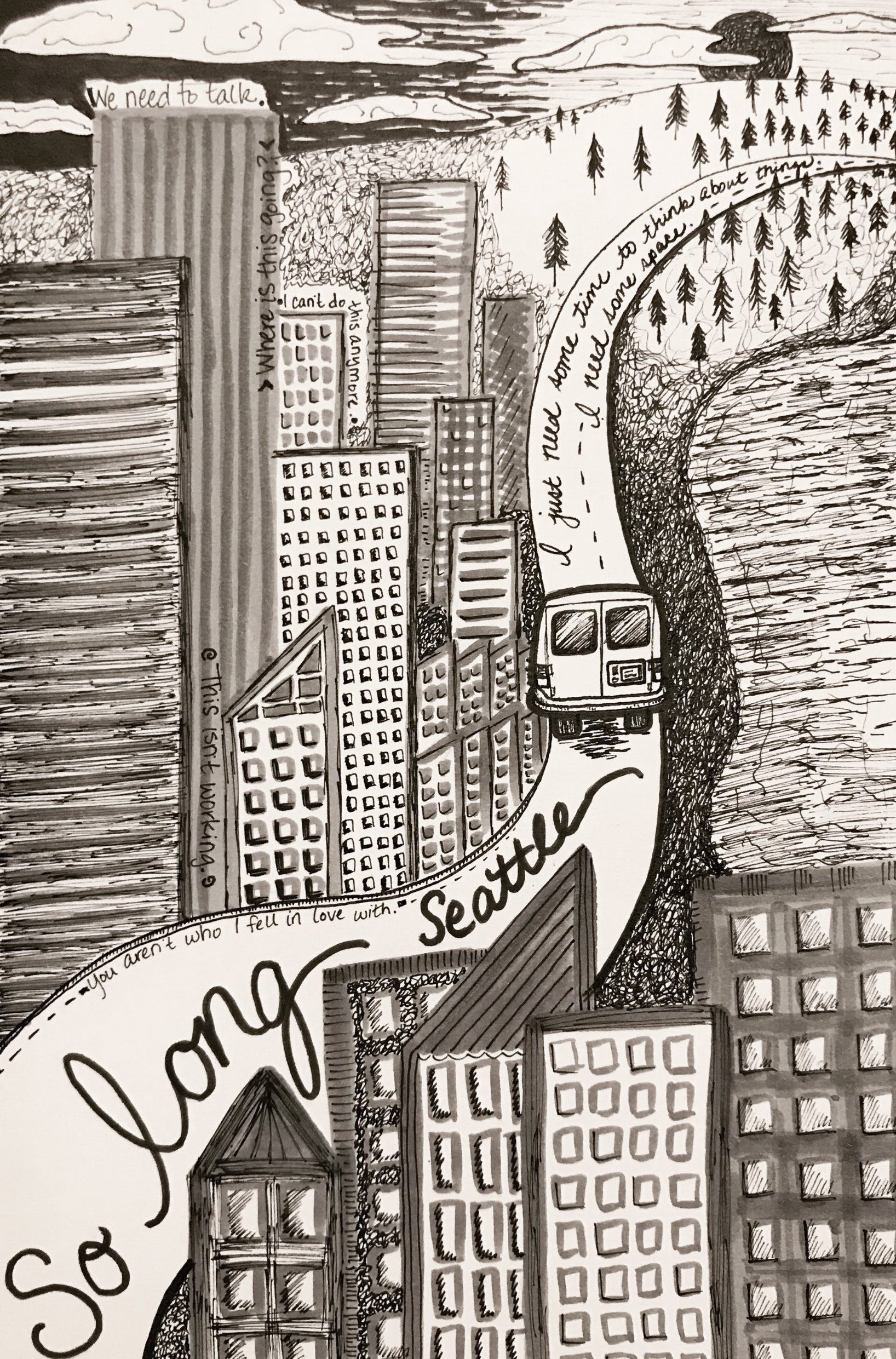
For this October meet-up, I wanted to feature our vehicle. We’re just days away from a major trip that we’ve been saving and planning for for 1.5 years. For the last couple of years we’ve felt our time in Seattle was waning and we’ve traveled around on weekend outings to assess where we might like to end up next. In the absence of that next-place appearing to us, but with it evident that it was nevertheless still time to leave, we planned some extended travel instead.

This piece ended up turning into a break-up piece and actually afforded me some closure for our Seattle chapter thus far. Without intending to, I wrote a piece to accompany this drawing. You can read it on my writing blog. Apparently, there’s a lot I have to say to this city. It feels good to be saying it now, but this just begins to touch on it all.

So in four days we’ll drive out of the city and into the forest. Then we’ll hop from forests, National parks, coasts, state parks and the like through 9 states through the winter and into the Spring. During this time we should get some answers and we’ll return from our travels ready to start building our next life chapter.

Snail spins slowly in space… 💛

Snail spins slowly in space… 💛


Tonal Sketches

One of my biggest takeaways from the weekend watercolor workshop is the benefit of tonal studies. Since tone is something that I’ve struggled with, I’m delighted to add this tool to my toolbox! It seems like such an obvious practice to me now, but all of the disparate pieces from my classes hadn’t settled together yet for me to figure it out on my own.

In my Drawing class last month we used thumbnails to help us determine our compositional arrangement on the page. Then, we would do our tonal studies with charcoal on our large notepads. But it hadn’t occurred to me that I could integrate the two. In both of the classes I took last month we worked with tone. In Drawing we used charcoal and in Ink & Watercolor we used ink washes. Charcoal is rather fragile and messy and ink takes time to dry between layers, so neither mediums were something I’d thought of doing quick sketch studies with.

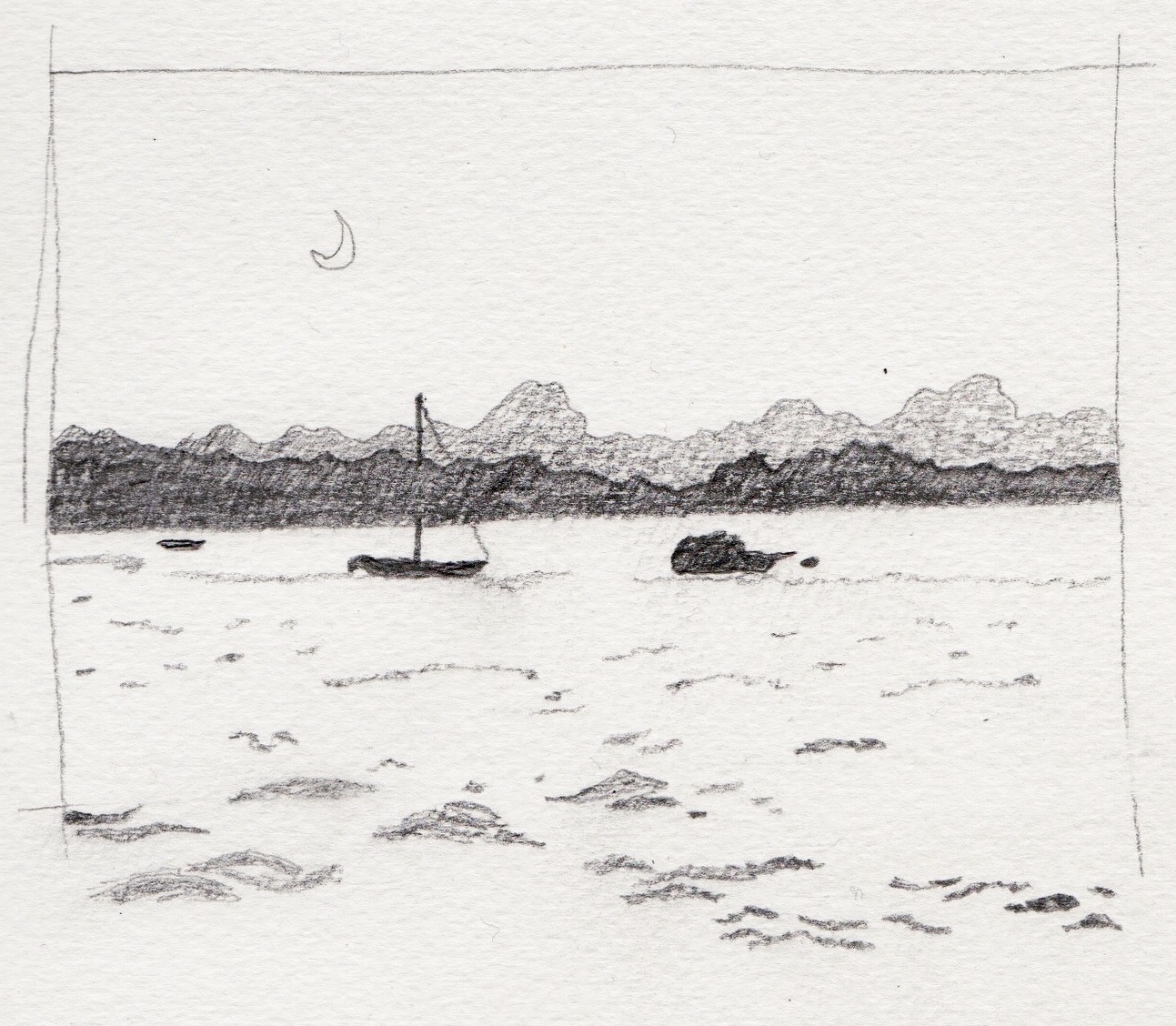
Yesterday in class I just used a pencil to lay down mid and dark values on my thumbnails. But our instructor also mentioned getting loose, quick sketches with an ink pen and a gray marker. I like the idea of practicing in that way because it maintains the same level of committing to the page and not over-fussing that we discussed in Ink & Watercolor. The temptation with pencil is to spend too much time shading in areas, or erasing when something goes awry. It’s easy to fall into making a fully rendered drawing instead of a sketch-study for a future work.

Each class I take contributes a new piece to the puzzle of my Build-Your-Own-Adventure approach to my art education. So, using the thumbnails I first learned about in Drawing class, the commitment to putting ink to paper promoted in my Ink & Watercolor class, and thumbnails as tonal studies from my recent Watercolor class, I have a new practice that I am pumped about using both out and about and at my desk at home!

Any finished artwork will most likely require an understanding of some combination of the following: color theory, tone, form, paint properties, perspective, and more. Any way that I can find to break things down into separate pieces is helpful for my learning. I can make more progress when I practice each of them separately and then integrate them together once I understand each of the pieces better. Otherwise things get messy very quickly! Any time I can limit some variables I’m grateful (For example: drawing only in black and white without color or painting my pre-stamped snails). These tonal sketches are yet another way to break down the process into bite-sized pieces. Instead of having to figure out tone and scale and form and perspective and paint all at once, I can figure them out one at a time!

For these, I started with a rough outline first (the 60-second pencil plan we used in Ink & Watercolor). Then I started examining my reference photo strictly on the basis of tone (as I did in my Drawing class with charcoal). This resulted in some lovely sketch renderings! But what’s neat is that I didn’t set out to ‘draw.’ I just sketched in some rough outlines and then filled in tone values as I practiced observing them.

I know this may sound really simple and to some it may seem that I’m belaboring it a little. But 2 months ago I thought I couldn’t draw. Last month’s classes taught me that maybe I could. Two weeks ago I couldn’t decode my supplies list for watercolor class, and now I understand the varying tools and supplies. All weekend long I felt like I couldn’t paint, and yet I did manage to get paint onto paper in a way that conveys subjects that are recognizable. I’m continually surprising myself and I’m so enjoying these simple revelations that help me glimpse behind the curtain and see how to break these processes down so that I can keep practicing and growing in my art.

A Friendly Nectarine

It was a drippy Saturday afternoon and I spent my time in the company of a companionable nectarine. It was a lovely nectarine, chosen because it was one of only two fruits amidst a sea of vegetables and I’ll take a fruit over a vegetable any day. It faded from a lovely shade of dark red tinged with maroon into a cheerful yellow-orange speckled with tiny flecks of red.

It was my task to paint the nectarine with watercolors. My first experience with still-life of any kind came last month in a couple of drawing classes. Prior to the watercolor class this past weekend my only experience with painting involved filling in drawings with paints. I’d certainly never done any painting where the paint stands on its own merit.

What follows is a record of my time with the nectarine.

I started by emulating the suggestions and the demo of the instructor. First I sketched in a quick outline of fruit and shadow, keeping it off center for more visual interest (as she suggested). I painted in the shadow first with an emphasis on adding any kind of reflected color or interpretations of color I could see in the shadow. (I was delighted to actually see some purple hiding under the front edge of the fruit!). I’m pleased with the way the color washes fell in and blended with each other. I especially like the dusty rose mixed with the purple in the bottom of the shadow.

Next, I began putting color into the nectarine. I started on the dark side while my shadow was still damp to see if I could get any fuzzy softness between fruit and shadow. I didn’t yet understand the watercolor concept of working light to dark, and knowing I didn’t want my dark red to go across the whole fruit, I stopped where I wanted it to stop. Unfortunately this created a hard edge that there wasn’t really much coming back from by the time I got my lighter colors painted in. So the fruit isn’t blended well and it’s generally overworked. I also had trouble knowing how best to define the crease in the fruit. My application of the orange coloring behind the crease isn’t well blended.

At some point while I was working on the fruit my instructor came over and suggested that my shadow edges needed to be softer, as shadow edges are. She tried to soften them (those additional brush strokes on either side are hers), but unbeknownst to me I’d selected a highly staining pigment, so it didn’t blend well after the fact. I learned to keep an eye on my shadows so they don’t wind up with hard edges while also becoming better acquainted with the properties of this particular blue. Valuable lessons indeed!

Knowing when to walk away is the most difficult task of watercolor. It’s so easy to make messes and overwork areas. It will take a lot of practice to know when to keep working wet (and how wet) and when to wait for it to dry. But I didn’t feel like there was much more that I could do to improve this particular nectarine, so I began my second.

My primary aim was to take all I learned from the first attempt and apply it to my second painting. My feathered shadow edges are much more soft and interesting! I worked hard to blend my fruit shades better this time, but had difficulty with a runaway wash of water when I tried to soften an edge. That runaway wash is what created the greyish strip down the middle of my fruit. About this time, I realized that I’d forgotten to put in the reflected color into the shadow. By the time I did the shadow wasn’t wet enough so the pink pigments didn’t blend in with the blue.

Feeling like this nectarine was quickly becoming a wash, I decided to go for a stylized sketch approach for the whole painting and added in some loose, chunky brush strokes into the shadow and the lighter portion of the fruit. This allowed me to blend the pink pigments I’d dropped into the shadow that were just sitting there, while also rapidly finishing up the piece so I could move onto another attempt. This did not impress my instructor (although I maintain that it is a valid style choice and one that is up to the preference of the artist who just wants to loosely sketch a fruit to completion before starting the next). The hard lines under the fruit and in the seam wouldn’t have been my preference, but she was rushing me along to the next painting, so I didn’t take the time to soften or blend them.

For the third iteration, she had me try the softer watercolor paper that I hadn’t been able to find at the store. She gave me a sample of hers and I started on the nectarine again. She asked me to fill up more of the page with the fruit. I worked on getting the coloring of the first painting with the softened shadow-edges of the second painting. This was a valuable exercise because this paper behaved much differently! My shadow bled all over the place (including what was meant to be a purple highlight which then blossomed into a distracting blob) and my fruit, while better blended, also ran all over the place including into my reserved white for the seam, and into my shadow.

By this time I was running into the end of class, so I didn’t have a chance to try to blend any of the things that bothered me about this fruit. I also wanted to add some speckled reds into my yellows because I thought they were too bright. I attempted to throw some last minute speckles on with my paintbrush, but my fruit was still too wet for it to show very well, and I didn’t have enough pigment on my brush.

At the end of class we hung all of our paintings on the wall for critique. From far away, my first nectarine translated the best (I just love the well defined form created by that highlight!), which isn’t a surprise, because I think it translates the best up close too. We left them hanging overnight and it was helpful to walk in the next morning and see them with fresh eyes. My first nectarine, the one that I felt so down on because of the hard edge transitioning from the maroon to the red, and my hard shadows that my instructor drew brushstrokes on the edges of, continues to be my favorite. Furthermore, I don’t mind my second nectarine either! I rather like its loose, rough, sketchy quality!

I think that the reason I feel most drawn to these first two is because they feel like they’re mine. I did them the best I knew how with the information I had and my current skill-level and they feel like a reflection of me. The third nectarine feels like a reflection of my instructor. I did everything she asked of me, to the best of my ability and with the limited time I had, and it just feels too loose and runny and frankly, kind of gross and muddy to me. It doesn’t make me happy.

So, all in all, it was a valuable exercise in which I got to enjoy some lovely time with a nectarine, learn about the different qualities of watercolor paper, and learn some skills for getting results closer to what I want (and tips for avoiding pitfalls into the things I don’t want). But it was also an affirming exercise in understanding a little more about what does and doesn’t feel a part of my personal style and embracing my personal preferences as a valid form of expression.

Weekend Watercolor Workshop

I’ve just finished a weekend watercolor workshop and I have to say it was a challenging couple of days. First, I want to highlight all that I gained from this class because while it was a frustrating and challenging experience, I also learned a lot.

One of my biggest takeaways is how to select papers. When I signed up for this course a month ago, I couldn’t even understand the code-language that the supplies list appeared to be written in. With the help of a friend to figure out paints, I selected supplies the best that I could and arrived at my first day of class. It turned out I’d misunderstood the criteria for selecting the recommended paper, but I had an opportunity to try out the preferred paper and compare it to the 3 samples that I’d brought. I went out that night and got the softer paper for the second day of class. I learned what it is, where to find it, how to tear my own sheets into smaller ones, and how it differs from the other papers I’d been using. This is a big and exciting win!

We began the first day with a useful exercise for understanding the reactivity of my paints with one another. Having the ‘wrong’ paper worked against me in this exercise so I didn’t get as much blending information as I might have hoped. That afternoon we painted fruits and vegetables. I spent my time with a charming nectarine whom I very much enjoyed but also now consider my friendly nemesis. (Friendly in that we’re on good terms. Nemesis in that we haven’t come to any sort of understanding with one another yet). I painted the nectarine 3 times, and I’ve written more about that experience here. I learned about the benefits of letting pigments blend softly into one another on the page and to be on the lookout for places where I can add softness to an edge to help give an object more dimension or to make a shadow look more realistically diffused.

On Day 2, we shifted to landscapes and brought photos to use as reference. Despite bringing my own photos, which should have helped spark some excitement, I felt zero interest in painting landscapes. Truly, the only photo I wanted to paint was a lovely, brambly snail. We started by sketching out tone-studies. I started with the lovely snail, but felt I should at least attempt a couple of landscapes so I sketched out a couple of those, but my heart wasn’t in them. I did decide to give one landscape a go, with limited success.

The challenge of the Sunday afternoon portion of the class was many faceted. Frankly, I was feeling pretty brain-fried and exhausted toward the end of this weekend intensive. It was a lot of practice and learning for a medium still so unfamiliar to me. I felt like I’d had very limited success and not a lot of breakthroughs during the weekend, so I was on mental-overload. And the more friend I felt, the more stressful the environment felt. There were a couple of times when I’d start to proceed on my landscape in the best logical manner that I could think of just to bravely get paint on the page in a not-too-terrible fashion, and the instructor would rush over and exclaim dramatically and attempt to fix things on my page. I was already feeling daunted by the page, but these moments added additional reluctance to put brush to page because I was so worried about messing up.

When I’m alone at home I’m not afraid of the page and I have a curious explorer’s mindset with my paints. But I was all tense and controlling throughout my landscape experience and it shows in the painting. I know what I would change about it in a second iteration and how I would make those attempts, but it wasn’t something I felt like doing in class because I was tired, I couldn’t loosen up, and my heart wasn’t in it.

So I turned to my snail, which frankly I wish I’d followed my heart and started on from the beginning. Painting that snail was my happy-place and it got me through the rest of the afternoon. It wasn’t the assignment, but it gave me a safe way to play with my pigments and experiment with translating my values study into paint and to work with the paints on the page. Mostly, I felt like the instructor didn’t know what to do with me, and I didn’t know how to execute her suggestions to me, so it kind of felt like an impasse. I felt like a dummy for a lot of the weekend because I could hear what she said, and it could make sense conceptually but I still found I didn’t know what to do with any of the information to execute it. The snail allowed me to continue to be physically present in the room and finish out the class while giving myself a mental break from all the stress and confusion I was feeling around expectations and my limited understanding.

But now that I’m back home and I’ve had a good night’s sleep, I feel ready to face my old nemesis the nectarine, who I intend to paint again today. I feel ready to try the landscape again and do the things I wish had gone differently in the first one. At some point, I’ll probably finish the snail just for fun.

So I learned a lot in this class, even if I don’t feel like I have any tangible watercolor work [that I’m proud of] to show for it. Thanks to this class I will become a diligent sketcher of tonal studies and can’t wait to see how that helps me improve. I also learned through this experience that I have no interest whatsoever in being a painter. All I’ve ever wanted to be is an illustrator and painting just isn’t my medium of interest. Watercolor is how I want to lay down color, but I want to do that as part of an illustration, not loosely on the page in suggestive strokes of skies and clouds.

Once I realized that, it made sense to me why I was so drawn to the snail and why I found the landscape such an uninteresting subject to paint. So while I appreciate the experience that I gained throughout the weekend, I think part of why the instructor and I didn’t know what to do with each other is because she wanted to make loose and suggestive watercolor painters out of us, and I just have no interest in painting for painting’s sake. But I didn’t realize that until yesterday evening after the class had concluded. Perhaps if I’d figured it out sooner, maybe I wouldn’t have felt so vexed and confused by her instruction and I could have opened myself up to the process more. Meanwhile, I’m back getting back into my curious explorer’s mindset and back at my own desk where I will be taking all the learning I received through the weekend into my future practice.

Fifth Urban Sketch Meetup

Everyone had already claimed their spots and were underway on their drawings by the time I arrived to today’s Urban Sketch outing. (I started my day downtown with my first Creative Mornings meet-up, which caused me to arrive over a half-hour late to Urban Sketch, but it was so worth it. You can view the recording of the event here. Look for ‘Tay & Val.’ It should be posted soon!)

We gathered at the lovely Woodland Park Rose Garden. The day was perfect. The early morning rain had stopped but clouds still hung dramatically in the air. The sunlight appeared only in a few brief intermittent moments, so everything was mostly lit in a soft, ambient gray light. The grass was trim, bright green, and damp. The roses were covered in glistening raindrops. It was idyllic really.

It didn’t take me long to find a spot. As soon as I arrived, I turned down one of the grassy lanes between beds of roses and was captivated by a gorgeous giant tree as soon as I saw it. I planted myself next to an elaborate spray of bright pink roses and quickly set to work.

In keeping with my need to do something totally different from my recent watercolor work, and as a continuation of my enjoyment of hatching random textured strokes yesterday evening, I decided to take a stylized approach to the lovely tree. One of the primary goals I have for myself is to learn to work more loosely, and to not be so tense and perfectionistic in my process. One of the things I really enjoy is hatching. So I decided to focus today on drawing in a loose manner while using more scribbling kinds of strokes.

I began by contouring the tree, first its trunk and then its outer canopy. Then I came back in and began the inner contours of its canopy. This I did lightly in pencil. I loved putting in these general contours. As I drew them in I thought of topographical maps. It very much felt to me as if I was mapping the tree. As I put in focused attention on the leafy branches of the tree, I watched a map of its topography unfolded on my page. It was a lovely feeling.

Next it was time to add color. Initially, I selected all the colors I thought I could possibly need for realistic color tones (some dark blues in the tree, some lavender in the roses) all those kinds of colors that are there that we usually don’t see. But as I started drawing in the canopy, I realized that kind of color-mixing wasn’t the primary focus of my piece, and I instead narrowed my selection down to just a few and began experimenting with strokes.

I enjoyed playing with the leafy textures. Different parts of the tree were revealing themselves in different ways. I used the contoured sections of canopy as an opportunity to play with a variety of texture, including some highly stylized spiraled lines there at the top. This gave me the idea to do the trunk and limbs in that same fashion.

As I drew in the maze of the trunk and larger limbs, I thought initially of ants and other insects and how they bore the most captivating patterns into wood. This led me to a contemplation of the beauty of woodgrain itself and how it moves and flows around knotholes and the like as it stretches its pattern through the wood.

As I worked, I realized that I really rather liked the unfinished portion of the tree. I liked having some white space up there as a counterpoint to the dense cluster of roses I knew I’d be drawing below. Of course, ideally, I’d especially love it if the white portion of the tree was in the left upper quadrant so that it created diagonally opposing visual interest in opposite corners of the page between it and the roses, but alas it was too late for that, so this is where I settled instead.

For the roses, I worked to carefully see the roses, each petal and how they formed into a flower, but I also worked to stay loose on the page: seeing carefully, but drawing gesturally. I wanted to get the feel of fully formed flowers and leaves but only intermittently and for it to mostly be made up of splashes of color and form. I think it turned out alright.

Lastly I came in and added all the supplemental details. The lawn, the mulch under the roses, the shrubs behind the tree, the bench sitting under its shade, and the blue-gray sky. In truth, the sky had dramatically gorgeous clouds mimicking the shape of my contoured tree canopy. They would have looked dynamite in here! But since I wanted the tree to be such a focal point I made it quite large to fill the page. So there wasn’t enough space around it to properly show the clouds. I knew that trying to include any of those cloud contours would only confuse things. So I oped for a flat wash instead. I used different strokes for the mulch, lawn, and shrubs. Then I used my blending stick to soften all of the secondary textures, which worked especially well on the shrubs. I loved how they receded after I blended them.

The final touch was to add some gray over the maze of the trunk, which both improved the coloring and also made the trunk look more textural. The maze acts as a foundation, but isn’t distracting with the gray laid over it; I really like how that turned out. I left the higher limbs lighter as an echo of the white portion directly across from it. I’m not sure if I like that result so much, but that was my reasoning behind it nonetheless. Finally, I highlighted sections of the outer canopy contours with darker lines, to great effect that I really love!

All along as I worked and made each of these creative decisions, I wondered what others would think. I wondered if people would see the big patch of white and think it was unfinished. Or if they’d think the overall drawing looked childish. But I realized rather quickly that I just didn’t care and that art can really and truly be anything you want it to be. Everything I did was with purpose and intent. I considered my strokes as I went, I varied them and tried different things. I savored the meditative process of contemplating canopy topographies, ants, woodgrains, and petals. I enjoyed the challenge of working fast and loose while still aiming to achieve some measure of realism underlying all of the high stylization.

Are there things I’d change? Sure! (I wish I’d added some varied tones into my grass instead of leaving it as a flat wash of one tone, for example). However, at my first meet-up (only 1 month ago) I was so overwhelmed by my subject and so insecure about sharing my drawing with others that I left that meet-up in tears. I felt so embarrassed and inadequate. Just one month later, I confidently chose a subject, made some stylistic choices to challenge myself and practice some varied techniques, and I was really proud of what I drew even if others might not ‘get it.’ But you know what? I got several kind compliments about the many strokes it took, the ambition of taking on the large tree in such detail, and the layout in general. That felt really good. So I guess my fear that my approach would be inconceivable to others was unfounded after all. :)

Watercolors for Days

The Cotman Sketchers Pocket Box. I’ve been using Cotmans for a couple of years now, since I started with watercolor.

The Cotman Sketchers Pocket Box. I’ve been using Cotmans for a couple of years now, since I started with watercolor.

I’ve been laying low here for the last week because I enrolled in Liz Steel’s Sketching Now Watercolour online course and it’s been keeping me quite busy! From the intro lessons alone, I was hooked. There’s so much for me to learn about paper, paints, and pens: all the things vital to my dreams for my future art endeavors. I’ve only just finished Lesson One, but I am learning so much already! (Already I’ve learned some techniques that I can apply to some snail-art concepts that I’ve had in mind for months. I can’t wait to get going on those again!)

I focused this week on spending as much time in the online course as I could because I have a watercolor workshop coming up this weekend. I signed up for this online class in advance in hopes that it could give me a boost before the workshop. I figure that having a baseline that’s more than ‘zero’ should help me get even more out of my weekend class!

But, as I’ve worked my way through the online assignments, I’ve finally started to feel the limitations of my student-grade paints. All along others have advised me that artist-grade paints make all the difference and are easier to learn with. Over the last two weeks, I’ve worked hard to familiarize myself with the different artist-grade watercolors and what other artists have to say about them. However, I’ve continued to be reluctant to invest in such costly paints because I don’t yet have a solid enough understanding of pigments, mixing, and paints to be able to build a palette with any confidence.

Practicing varied washes with the Cotmans. I’ll have to do this exercise with my new palette soon. I can’t wait to see the differences!

Practicing varied washes with the Cotmans. I’ll have to do this exercise with my new palette soon. I can’t wait to see the differences!

But thanks to the very practical help and generosity of a dear friend, I got my first artist-grade watercolor palette set up today, months earlier than I originally planned! I couldn’t have done it alone because I am still so new at color-mixing to know what I would want or need. Having the opportunity to go through, paint by paint, with someone who has watercolor experience and also knows my personal style and color-goals was a priceless experience! I’m very grateful. I trust using better quality, more pigmented paints will have a positive impact on my studies (at least that’s what I keep being told!)

As lovely and colorful as this immersion has been (with all of the online classwork and the hours spent researching, shopping, and setting up my palette) I admit that it left me rather brain fried and in need of a break! Luckily, it will take a couple of days for my freshly squeezed paints to firm up in their pans so it’s a mandated moratorium on all things watercolor.

Instead I spent my evening sitting next to my new and lovely palette. I gazed lovingly at it and occasionally poked at it to see if it was dry yet (definitely not) while I spent my evening working on pen strokes.

After so many hours of learning about quality paints and papers in a medium I don’t yet understand, honestly all I wanted was my extravagantly feathered, cheap, ballpoint pen and a plain old spiral notebook. These are tools I know inside and out. I’ve been doodling with ballpoints on lined paper since junior high. It was the perfect chill antidote to all the fancy, brainy learning and research I’ve been doing the last couple of weeks. It was the equivalent of tucking into a mom-made casserole. High class cuisine is a treat to be sure, but sometimes all you want is the familiarity of some comfort food.

These pen stroke exercises are from Pen & Ink Drawing by Alphonso Dunn. (His YouTube channel is a great help for watercolor and color theory as well. His color theory videos got me started in beginning to understand color-mixing!)

I’m going to go do some more comfort-sketching and then I’m going to bed! Goodnight y’all. 💛

Fourth Urban Sketch Meetup

It was a sunny and cheerful Friday morning. The ground was damp from a light rain the night before and the Urban Sketch Seattle group met at the library in the Queen Anne neighborhood. After our initial round-up, I headed straight over to the pink Methodist church because I'm so enamored with it's pink-ness!

I sat myself up on a retaining wall diagonally across the street from the church and began doing my pencil plan. In my Ink & Watercolor class, we were encouraged to keep our pencil plan to 60-seconds so as to stay loose and not get bogged down in perfectionistic details. For my first two USK visits, I stuck to that plan and strove to loosely follow the model of that class (60-second-pencil-plan, inking in contours, putting tone in using ink-wash, and glazing in the color with watercolors). I'd never drawn on location before and both times (and also due to my lack of experience) I inadvertently selected challenging subjects (trying to fit in too much subject matter the first meetup and not enough in the second). I was disappointed with both of those drawings.

By the third meetup I started to hit my stride. I selected a lovely old building that I was quite smitten with upon first glance. I've long loved old buildings and I happily sat myself down to spend time with this one. For the first time I felt I'd found the right balance in my subject of 'enough but not too much.' I knew I wanted it to turn out well and liked that it was mostly a box-shape. I began by using what I'd been learning in my Observational Drawing class. I ran into some trouble with perspective, and worked and reworked it, but when I couldn't get it just right, I gave myself permission to move on because I knew I needed to get started on inking it.

I spent a full hour on my pencil plan. This didn't worry me, as I felt my plan was so solid I should be able to ink it in quickly enough to finish the drawing in the remaining 1.5 hours. I worked diligently and squinted to see all of the details in the brickwork which lended to it's charm. I had to quickly problem-solve how to give the appearance of bricks (both vertical and horizontal) when I was starting to run out of time. I felt tempted to avoid the messy garage before deciding that it lended too much visual interest and that if I left it stylized but based on some things I could see in it, that it would be easy enough to render in time.

I finished just in time and it wasn't until I came out of my delicious drawing frenzy that I realized I'd only drawn the building itself without any context whatsoever! It was floating in midair! I'd honestly been so absorbed in the beauty of the building and it's detailing that I hadn't even considered any of its surroundings at all! After the throwdown, where we all shared our drawings, I went back to my perch and kept working. I wanted the building to have something proper to sit on. I penciled out some of the contextual surroundings and then took a break for lunch. I came back and got everything inked in and left with an unfinished (nothing on the sign above the garage, none of the towering trees behind) drawing that I felt quite satisfied with.

Week 3 was my first experience with merging the skills I'd been learning in my Observational Drawing class with my Ink & Watercolor class. It was the first time I gave myself permission to take the guidelines given to me by each of my instructors (one approaching from a detailed, highly-accurate, realistic perspective, and one coming from an approachable, loose, empoweringly forgiving, stylized perspective) and combine them into an approach that works for me.

Here's the thing. I don't have a lot of drawing experience really at all. My eyes are barely trained in seeing things in a way that allows me to interpret them on a 2-D page. I am very much a beginner. So if I want to have a drawing that I'm proud of it's going to take me a while to dial in and interpret what I'm seeing in a way that can be believably rendered. I need more than a 60-second pencil plan! However, I also don't have any interest in creating highly-realistic drawings. I want my approach to be stylized and an interpretation of what I'm seeing.

So, this is all of the learning and experience that I brought with me to this fourth meetup when I sat down in front of the little pink church. I spent a decent amount of time on my pencil plan, making sure I was seeing angles and proportion and scale reasonably well. But I also didn't let myself get hung up on it. I blended the approaches of my two instructors. This resulted in a drawing that I'm really proud of, but that also has some personality to it. The cross is a great example: I found the 3-D nature of it very challenging, but I sketched it out as best I could, working hard to see it as my Obsv. Drawing teacher taught me to assess things, but not overworking it to perfection and instead committing as best as I could and getting it inked in. The result is a cross that is believably 3-D and also one that has some wonky personality to it! I didn't know how to do the front steps, so I just thought about what I knew steps to look like from my O.D. class and inked it in like a champ. They look convincingly great!

The truth is that this church actually has a winding ramp with rails leading up to the front door, and an awning coming off of the alcove on the right side. They didn't make it in because I realized my initial layout hadn't left enough room for all that railing. I also wasn't confident about putting it in anyway, so I didn't mind that there wasn't room for it. The awning kind of flew under my radar long enough that I missed it at first and just left it that way. Delightfully, I liked the way my drawing was coming together so I didn't mind the way this interpretation worked out with those missing pieces. Though I do find it very interesting the things that we just don't see sometimes! (Case in point: there should also be another smaller tree in the grass median on the right-hand side. I was stunned to discover its existence after 2 hours of staring at this scene!)

After the throw down, I did return to put in some more window detailing in the bell-tower and on the left-hand side. That was the beginning of the left-hand side getting too overworked, which I then made worse by overworking it some more. That was a valuable lesson learned.

I stopped short of adding in the brickwork on the bell-tower or any of the dark roof tiles because I decided I'd like for this to be my first hybrid piece! I'm pleased enough with how it turned out that I am thinking of giving it as a Christmas gift to a couple who I know love this church. So I wanted to preserve it as it is, scan it in, then print out a few copies to test some different roof and brick textures on before deciding how I want to add in that detail. I will also digitally erase the mess on the left-hand side and sort out what detail should be left in and what should be removed so as to better understand how to interpret multiple layers (tree, shrub, window) in pen and ink so that it looks believable to the viewer and not like a mess. (I think I'll handle it like I did on the right hand side where that tree obscures the building in full, which looks very believable).

Once these decisions are made, I will make a fresh ink drawing based from this original piece and add color. It's an ambitious project, but I'm feeling optimistic. And I'm super excited about integrating some tech into my process and seeing what I learn from that adventure.

So this is the story of my Fourth USK meetup. But it's also the story of learning to integrate teaching methodologies into a process that works for me at my current level of ability. Blending these two approaches has increased my confidence and my sense of agency. I'm starting to make work I'm really proud of and I'm enjoying the process of creating it.

Last Ink & Watercolor Class

It's now been a week since my last Ink and Watercolor class. I haven't posted my summary of the class sooner because I fell into an internet hole for a few days in which I did nothing but work on finishing up this website! I've also started an online watercolor course, so that's been keeping me busy as well. But I'm delighted to be sharing this summary with you now, because a lot happened on this last night of class!

The agenda for the class was to take a still-life to completion: 60-second-pencil-plan, contour outlines, ink-wash layers, watercolor layers, and final hatching. I brought the same snail to class wanting to practice drawing it from behind and challenge myself by trying to sort out foreshortening for the first time. The goal was to have the snail appear to be climbing up onto the cassette-tape box.

The infamous tape that gave me such trouble and resulted in the snail's wonky eyes. Also, notice the pencil lines suggesting where the snail should have gone to appear properly grounded. I do love the gorgeous texture on his skin though!

The infamous tape that gave me such trouble and resulted in the snail's wonky eyes. Also, notice the pencil lines suggesting where the snail should have gone to appear properly grounded. I do love the gorgeous texture on his skin though!

Oh mercy, it seemed like from the beginning it all went off the rails. I thought the cassette tape would be a good exercise in a basic shape (two rectangles) with some added interesting detail (the round and square cut-outs, for example). Boys as I wrong! First off, I once again got befuddled by contours as they relate to holes. Contour lines are something I can stick my pencil-tip behind. I continually draw the wrong side of 'hole' contours because I'm SEEING the line in the back (it was distinct! It was dark and black!) and not the one in the front (which doesn't even appear to be there. It's more like the absence of something!). But the back line, no matter how pronounced, is not a contour. So I had to white out my mistaken back line in the toothed tape-holes and add in the front line. Holes like that get me every time.

I also got hopelessly muddled on keeping my tape-box lines sorted in my head. In my Observational Drawing class, our instructor insisted that we draw all of our shapes through our other shapes, just to make sure we're staying on track and things end up in the right place. At the time he gave me that feedback, I admit I was unsure. But since then I can definitely understand it! It would have helped tremendously in this case. I ended up with a back, top-left corner of a tape box that shouldn't have been there because it lined up incorrectly with the lines it appears to join up with.

The front-edge of the cassette tape actually turned out to be terribly tricky. I got so bogged down with misdrawn lines and made quite a mess of it. So by the time I finally got the cassette to an okay state, I'd quite forgotten about my snail's lovely eye-stalk tentacles. That's why they look so goofy, because I had to work around the tape that I'd already inked in.

So I'm still working on seeing things 'front-to-back.' More often than not, I get carried away by working on the 'next-nearby-thing' rather than assessing my front-lines again. So, in this case, I started with the mushroom (a front-most thing) and the orb (which stood alone), then went on to the tape box (the next-nearby-thing to the mushroom), making sure to not finish all of my lines so as to leave room for the cassette tape and snail. What I failed to catch, however, is that I needed to leave room for my snail's tentacles too.

I must be more careful about keeping an eye on ALL PARTS of my front-most objects, not just the one I start with and not just a portion of the one I'll be getting to next (like leaving room for the snail's head, but not his tentacles). This is a good reminder to keep my image working at all the same rate and not get too bogged down in one area, as my Ob. Drawing instructor was always trying to help remind me. By getting so bogged down in the tape, I lost sight of the snail, which was actually my primary subject and interest in completing this piece.

So everything was off to a terrible start and honestly I felt like a big storm cloud was settling over me. I admit I was grumpy about it! I thought more than once about starting over, but felt like that defied the intent of the class (to let go of perfectionist tendencies and just be in the sketchbook and being flexible with how it all manifests as it goes along). I even pulled out a sheet of tracing paper I had tucked in the back of my book from a former project. But again, it didn't seem in keeping with the intent of the class. So instead, I took notes on the tracing paper about my process and my challenges and resolved to write about it later. Meanwhile, I finished inking and then took a quick break and called Benjamin to fuss about the disastrous consequences on my page. (Sometimes just fussing to Benjamin can help me feel better. He's a very patient person and I'm grateful he let's me fuss! :-D)

I came back in and worked on my ink-washes. I tried really hard to see the tonal qualities. Even though I didn't like the drawing, it was still a great opportunity to practice applying tone. I really applied myself and am largely happy with how that part turned out. I can tell I'm making progress with tone and ink-wash, so that was encouraging! But I decided not to take the drawing into full-color since I was hardly invested in it after so many mishaps during the contour portion.

The second contour-drawing in which I spent more time with my pencil-plan. The snail looks properly grounded here, like he is firmly stuck to the ground while reaching up to climb onto the cassette case. Also, his eyes are properly alert in the dire…

The second contour-drawing in which I spent more time with my pencil-plan. The snail looks properly grounded here, like he is firmly stuck to the ground while reaching up to climb onto the cassette case. Also, his eyes are properly alert in the direction he is headed!

Instead, I turned the page and started the drawing again. This time I spent more than 60-seconds on my pencil sketch. I used what I learned in my Observational Drawing class and worked harder at forming my shapes. I drew all of my lines through each of the objects to make sure everything lined up. I used some tracing paper to trace my snail. I took a photo of it to have the camera flatten the image for me and laid the tracing-paper over the snail to see where I went wrong.

After trying to sort it out myself, I asked for feedback from my instructor about how I could have made my snail look properly foreshortened (since again, that was the whole point of this piece for me) and he helped me see where I'd made assumptions about what I saw and helped me see what was actually there instead. (You can see those pencil corrections on the first drawing. The snail's body should have been wider on the left side). I used all of that information to inform my second drawing, which I had just enough time to contour and which turned out much better than the first! (I've written more about how I'm finding a happy medium between my two classes here).

Then, I went back and did a little half-hearted hatching and final contours on the original drawing, just to have something to show at the end of the class. Of course it would have been lovely to end class on a high note where I felt like I'd improved wondrously and had a final drawing I was really proud of! But honestly, this feels more authentic anyway. It's an accurate reflection of where I'm at in my learning and the most significant takeaway from this last class in my opinion is that I used my agency to pick and choose what I wanted to get out of that class.

Sometimes the most important thing is to push through the imperfections, but I'd done that all of the previous weeks. That wasn't what I felt like I needed practice on. Instead, I needed to figure out how I could make the best use of my time in that class and so I chose to really focus on dialing in my practice with seeing tone and layering washes and for that to be the sole important purpose of that first piece. I chose to start the drawing over again, discarding the '60-second-rule' for pencil-planning and instead seeing how I could begin to integrate my learning from my two classes to create a better piece. Then, I asked for help in improving the one skill that I'd never practiced before (foreshortening) and couldn't see well on my own.

This to me actually has all the hallmarks of a successful class. Success won't always mean that I end up with a final drawing that I'm proud of. But showing up, problem-solving, knowing how to prioritize what's most important to me, and asking for help when needed are all indicative of much success indeed!

This whole course was wonderful. It gave me the courage to put things on the page. It inspired me to keep my sketchbook on me and take it all over. It introduced me to the Urban Sketchers community. It encouraged me to not over-think it, to cut myself some slack, and to just keep drawing. Truly a successful experience.

Last Observational Drawing Class

We had such a great last drawing class today! After learning about composition in the classroom, we took our easels and pads outside and sketched on location! I worked in charcoal focusing on setting up contours and value in my scene by adding and subtracting values. It was great practice in both form and tone. It’s fun to see a barely begun piece like this knowing what I’d do to keep going, adding and subtracting, until it’s all finished. This beginner’s understanding of the unfolding of the drawing process is all due to this class!

My biggest challenge is remembering to take a step back and not get overly focused on one small piece of the page, but to keep working the whole piece evenly throughout: to not get too focused on only tone or only line and overwork one small section, for example.

I also got some super helpful feedback from my instructor on how to better see the address book in my homework project. I knew it was wonky, but didn’t problem solve it well. So I’m very glad to have help seeing it more accurately! Additionally, I was able to ask for some feedback on how I could have better translated some problematic pieces in my ink-pen drawing that I did at the last urban sketch meet-up. (Can I just say that it is the most miraculous thing to me that my instructor can just LOOK at my drawings and know immediately how to fix it?? It’s honestly so fun and impressive to watch. He’s never studied any of the buildings or still life scenes that we bring into class, and yet he can walk right into the drawn image and demo a fix for you on the spot. It’s so cool).

I know I already said it, but I’m so glad I took this class. And now I’m even toying with the idea of taking figure drawing later next year, which I never would have ever expected from myself. Meanwhile, I’m just going to keep practicing what I learned these last five weeks and keep growing my skill set!

Final Drawing Project

Today is my last Observational Drawing class. I wasn’t excited about this class going in, but as it unfolded I can honestly say it was such a great class and I’m so very glad that I took it. I thought ‘still life’ would be such a boring subject, but I’ve actually enjoyed it so much! I thought black and white would be boring too, but it’s actually been super rewarding and fun! The first couple of weeks felt frustrating and discouraging, but things started to gel in the third week. And after we covered charcoal in the fourth, I was hooked!

This is my final project. A ‘self-portrait still-life’ filled with objects meaningful to me. So I chose a snail (obviously) and one of Parsley’s plants; my address book for all the letter writing I love to do (not to mention the snail stationary that I make!); a pen for the letter writing and drawing both; and watercolors because of my love for vibrant rainbow colors.

Five weeks ago I thought I couldn’t draw... and look at me now!! I honestly can’t believe I drew this. I didn’t know I had it in me! It’s the best drawing I’ve ever done, I truly enjoyed the challenge of doing it, and I am so proud of it!

Third Urban Sketch Meetup

This is the drawing I did last Friday with Urban Sketchers Seattle. I completed only the building with all of its detail during the allotted drawing time. Then I stayed afterwards for an extra 1.5 hours to work on the bakery and street and parking lot and other such surrounding details. I penciled in a few thoughts on the towering canopy behind but haven’t done any background trees yet.

After sitting with it over the weekend, I’ve decided I’ll either go back and completely finish it on location, or it will stay as is. I really don’t want to finish it at my desk, as I extra especially enjoyed being on site with this lovely old building. After spending 4 hours with it and studying it, it feels like an old friend. One that I’d kind of like to go see again.

We will see if I make it back there in the coming few weeks to add trees and color. Until then, here’s my mostly finished black-and-white, which I also really love (and which is contributing to a little of my ambivalence about finishing it. I love it so much the way it is!)

Finishing it will necessitate a second meaningful experience (rather than sitting at my desk) or it will stay as is, to mark the first enjoyable experience already savored. I’m still waiting to see which direction it will go.

First Snaily Still-Life

From Ink & Watercolor class last week: an insulator from my dad’s collection, a pretty rock, a snail, an old bottle of stamping ink, a small piece of jewelry, and two shells.

I’m very happy with how this one turned out. My studying of color in the days before class helped me be able to better mix colors to match what I was going for which was so rewarding! I still had to ask for helpful reminders about how to mix brown and black though. I don’t have those memorized yet (although by now I can remember brown. I still can’t remember black).

I spent the most time on the snail, because obviously it’s the most important part to me. It was my second go-round with a sparkly rock and it went much better this time. It was my first time with translucent glass and I’m quite pleased with how it turned out except that I accidentally painted over my highlights in my insulator. Good grief! But that pitfall paint over all my highlights in my ink bottle so I’m super pumped with how that turned out!

I spent a lot of time trying to really see the lid on the bottle and it turned out much better than past attempts at similar items. While the pink shell isn’t even discernible (it’s on its side, you’re looking into it’s hole), the yellow one turned out better than I expected upon first contouring it, so that was a pleasant surprise.

I still need to work on color-mixing (the snail’s body turned out darker and more yellow than I wanted) and tone, but it’s encouraging that each week I can see measurable improvement!

There's only one class left. I will miss this class when it’s over, but these still-life exercises have been so helpful that I suspect I’ll keep doing them at home. It will be a great way for me to continue working on seeing contour, tone, and color - which are all areas that I need a lot more practice in!

Color Playdays

Fridays-Sundays are my color playdays. And if you know me, you know I *love* rainbows, so this smattering of colors on my desk kept me pretty happy this afternoon!

Today I picked up a new book at the library (Color, by Betty Edwards) which I began reading this morning and am really enjoying so far! Yesterday I was happy to stumble upon the Blog over at Scratchmade Journal and enjoyed reading late into the night followed by some more reading today. That’s where I learned how to make this gorgeous color chart and start getting better acquainted with my palette!

Last weekend I was watching color theory videos on YouTube and this past week my friend Katie made a color chart of her palette for me, which was super helpful in seeing how she works with paint and why she chooses the colors she does. She also gave me tips on making my own color-mix flash cards which I am super keen to do now that I’ve completed this first exercise and can narrow down which color-pairings I want to focus on getting to know better.

Slowly, I’m building up a working knowledge about color. I’m obsessed with color and have always wanted it to be part of my art, but I’ve been quite limited in my understanding of it. But I dream of making a palette that reflects me and my personal style. I don’t even know what my style will become yet, so I’m learning all I can about color and paint. I’m playing with the set I’ve got and I’m taking a couple of watercolor workshops in the fall. My goal is to start my first custom palette in the first quarter of next year. *I’m so excited.*

24k Drawing Magic

When I sit down at a blank page there’s always that frozen moment where it feels like too much to know where to begin. But if I put on my headphones and turn them up, I can’t hear any of the narratives in my head that try to cause me doubt. All the drawing I’ve done in the last 21 hours was made possible by Bruno Mars’ 24k Magic album (actually David Bowie’s Hunky Dory kicked things off, but I always end up back with Bruno).

With the music giving me a kick start, I can then get into the drawing. But once I get into the flow of it, I lose track and don’t want to stop to find more music. So I listened to Bruno's album on repeat for 2.5 hours last night and for 4 hours today. Excessive perhaps, but it sure does get the job done! It’s just the right mix of upbeat energy, sass, and not taking yourself too seriously - all of which make it easy to jump right into the page and get lost.

Here’s proof positive that Bruno is the best for me to draw to... I went out yesterday afternoon to draw the Locks and I was listening to Willie Nelson and it was a disaster. I couldn’t figure out my perspective or my scale or anything to make it right. I gave up and went home. I love me some Willie (like he’s one of my top favorites ever... dare I say top 2?!) but it seems that he can’t make me draw like Bruno.

Thanks to Bruno I’ve made not one but TWO drawings that I’m pleased with, and I can’t wait to share them with you! But I haven’t scanned them in yet because I spent the latter part of my afternoon in a quiet office avoiding putting trees into today’s drawing. I didn’t have my headphones so there wasn’t any 24k Magic in my head. Coincidence that I couldn’t commit to the tricky foliage? I THINK NOT. 😁

So instead, I decided to jump into photoshop and make this silly picture. It’s a detail shot from today’s drawing with Bruno on the sign I haven’t finished yet. But let’s be honest: I haven’t known my way around Photoshop since 2000... so me making this image actually consisted of me asking Benjamin how to distort the perspective, learning a new thing, and then having him finish it up for me because I kept having more questions. It took him seconds! He’s a true master-wizard of Photoshop!

The whole process of making this image also gave me some perspective on perspective. As hard as I think it is on paper, it sure makes more sense to me there than in Photoshop! So the next time I’m feeling like it’s hard to get my perspective right on the page, I’ll just be grateful I don’t have to do it in Photoshop. :)

First Charcoal Drawing!

Yesterday’s drawing class was great - my favorite one yet! We spent the first half of the class reviewing everyone’s homework, which was extremely helpful. Last week we covered perspective and we were all pretty hung up on the implementation of it in one way or another. So it was great to see everyone’s work and to discuss, ask questions, and learn together what worked and what didn’t and why. I learned so much more from reviewing each other’s work than I did last week while trying to implement the concepts myself. It was great!

Then we learned about tone and used charcoal to make tone-drawings. I’ve never been interested in charcoal because it seemed messy and high maintenance to me. But wow, was it fun! I like it so much better than the graphite line drawings we’ve been doing, but I understand that all of that foundation was necessary for us to be able to execute a drawing like this.

I’ve been struggling with tone in my ink and watercolor class. As I mentioned in a previous post, I tend to not see enough whites from the get go and apply too much tone from the beginning, which there’s no coming back from.

But in this case, we don’t build up tone in one direction from white, but instead start with the mid-tone and then add and subtract tone in increments from there. This makes learning tone so flexible and forgiving! I’m planning to do more charcoal sketches to help better develop my eye and then translate that learning to improve my ink wash applications in my other class. I’m feeling pretty hopeful that this is going to help me start being able to see tone better!

Also, I’m wildly proud of this drawing. I’ve never done charcoal before and it’s not even a finished piece (if I’d kept going the darks would keep getting darker and the lights lighter), but dang - it still looks so good and the objects look recognizable. It’s the first time I’ve come home with a piece that feels like an actual image instead of just a bunch of unfinished pencil lines. I am feeling super happy about that!